Reimagining group spending for mobile banking-Santander KiTTi
MOBILE APP
Making group money simple, social, and secure.
Santander Kitti made group spending easier, more social, and dramatically more engaging—unlocking a 313% rise in users and a 1600% surge in processed transactions just months after launch.
The challenge? Turn a lightweight MVP into a scalable, user-centered product without sacrificing security or simplicity. Kitti's core "money pot" feature—where friends could pool funds and spend together—needed to evolve into a richer experience that felt less like a bank and more like a social utility.
Our team at Nimbletank partnered with Santander to redesign the experience, integrating playful yet trustworthy features across iOS and Android.
We refined the architecture, tested with users, and rebuilt the app into a secure, cross-platform tool with high-velocity mobile releases that responded to real-life group behaviors.
KEY SKILLSResearch, personas, information architecture, user flows, sitemap, sketches, wireframes, testing, digital prototyping.

Outcome
Product velocity, user growth, and mobile moments that matter.
We helped evolve Santander Kitti from a basic MVP into a Commercially Viable Product (CVP) by integrating new features that resonated with users and reflected real-world group behaviors. Ultimately, this meant creating more mobile moments that matter to our audience—making life and group money easier.
With faster release cycles and a more engaging interface, the product achieved:
The results:
Release cycle improvement.
Rise in users over the first 4 months of the launch.
Jump in monthly average transaction value.
Uplift in processed transactions.
These outcomes helped Santander expand its reach to younger, digitally native users-turning a niche idea into a scalable, socially-driven product line.
Next Steps:
- New features integrations.
- New functionalities integrations.
1. Discovery
We reviewed other apps to see how they approach the same subject. In many cases, the apps were to share / split costs.
KiTTi was unique for it's money pot concept. Having to integrate the 2 concepts of money pot and a bank was challenging so we approached the concept via a different angle.
We expanded beyond that field and looked into apps offering social interaction such as Split Share, Splitwise, iExpense diary or IOU.
With a better understanding of the competitors in mind, we analyzed the KiTTi app features and services as well as its competitors.
This helps to define key features or services to challenge in the next step. Here is an example of the feature analysis we have performed.
Features |
|||||
|---|---|---|---|---|---|
| 1 | Create group / account |
|
|
|
|
| 2 | View participants |
|
|
|
|
| 3 | Expense entry |
|
|
|
|
| 4 | Category allocation |
|
|
|
|
| 5 | Invite friends |
|
|
|
|
| 6 | View groups / accounts |
|
|
|
|
| 7 | View activity / summary |
|
|
|
|
| 8 | Add a comment |
|
|
|
|
| 9 | View balances |
|
|
|
|
| 10 | Export activity / summary |
|
|
|
|
To design the right solution, we needed to understand both the prospective organizer or participant. We interviewed 18 people in 3 days representing the audience. We wanted to find out:
- How they are managing a group money scenario?
- What works for them?
- What they are dreading the most?
We then presented the KiTTi app, let them play with it, and collected their impressions.
Key findings
- Interviewees over 30 years old expressed more concerns over the transaction fee.
- Interviewees felt reassured that the app was operated by a bank.
- Group lead interviewee expressed that the most uncomfortable moment was chasing people for money and a nudging feature was a good approach.
With the rich information gathered from interviews, we created a few personas, but settled with 3 representative users:
- Meet Andy, who prefers participating.
- Jenny, is an organizer at heart.
- Clare, Supermom is managing her 3 kids' extra activities.
 Andy, 24
Participant, single, house sharing
Logistics Technician
"I used to organize going to concerts with friends but now, I prefer to tag along. The money collection was stressful."
Needs
Being able to see my contributions.
Communicate with other participants.
Pain point
Having to keep a list of my contributions to events.
Andy, 24
Participant, single, house sharing
Logistics Technician
"I used to organize going to concerts with friends but now, I prefer to tag along. The money collection was stressful."
Needs
Being able to see my contributions.
Communicate with other participants.
Pain point
Having to keep a list of my contributions to events.
 Jenny, 28
Organizer, in relationship, sharing house with family
Project Manager
"I like to know where my money goes and keep a close eye on my budget."
Needs
Being able to track all the transactions made.
Being able to see and re-distribute any left-over money.
Pain point
Not having clear visibility on my expenses.
Jenny, 28
Organizer, in relationship, sharing house with family
Project Manager
"I like to know where my money goes and keep a close eye on my budget."
Needs
Being able to track all the transactions made.
Being able to see and re-distribute any left-over money.
Pain point
Not having clear visibility on my expenses.
 Clare, 38
Organizer & participant, married, house owner
Stay-at-home mom
"I need to keep track of the kids' activities, contributions made and Excel becomes cumbersome!"
Needs
Being able to see the list of the parents participating for an activity.
Being able to track the contributions made.
Pain points
Tracking activities on a spreadsheet.
Chasing people for money contributions.
Clare, 38
Organizer & participant, married, house owner
Stay-at-home mom
"I need to keep track of the kids' activities, contributions made and Excel becomes cumbersome!"
Needs
Being able to see the list of the parents participating for an activity.
Being able to track the contributions made.
Pain points
Tracking activities on a spreadsheet.
Chasing people for money contributions.
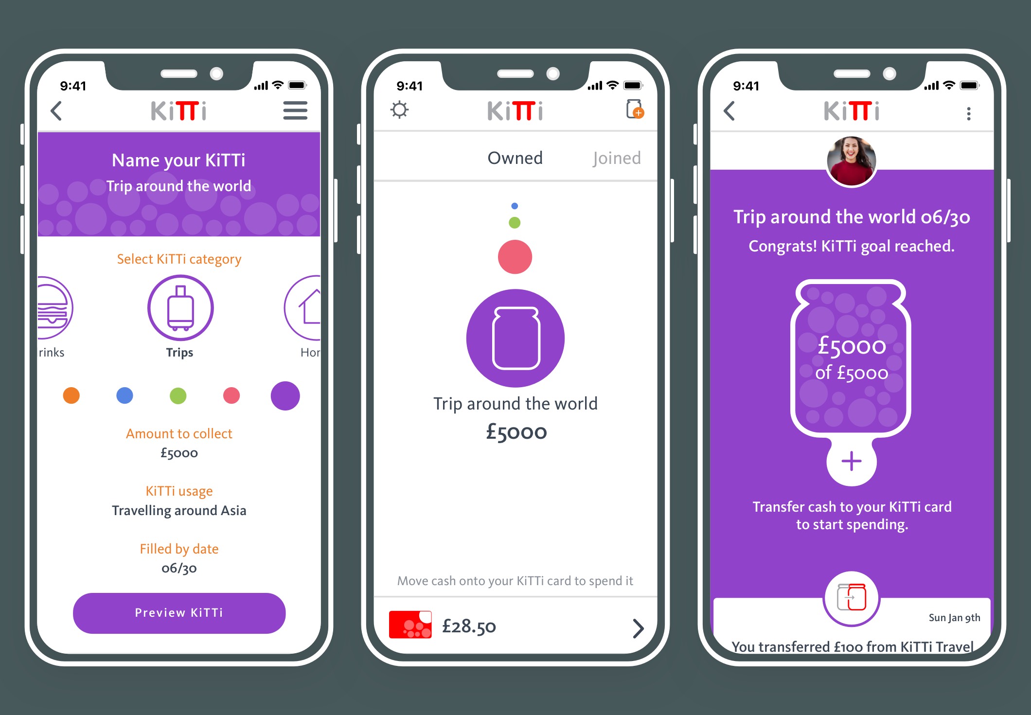
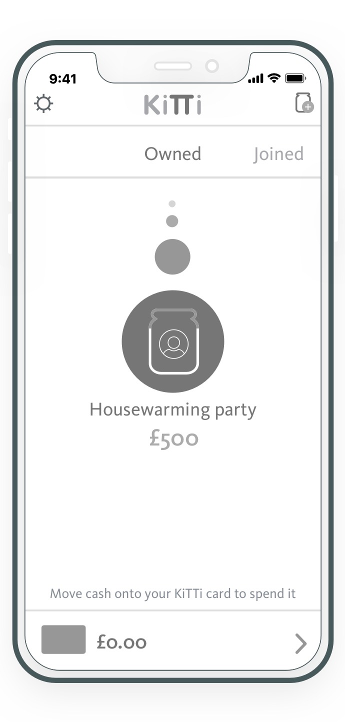
User flow
To create a better experience for the organizer and the participant, we drew the current user flow and site map. We did several iterations, with the intent that it will enhance the experience for both.
This user flow focused on Jenny, who is looking to create a new KiTTi for sharing house bills with her sister and their respective partners.
Site map
Drawing the existing site map to embed our solution was the natural approach. We used the original structure and added functions to the existing hierarchy without intrusion.
2. Ideation & Design
We did over 10 sketching session during the course of the project. Each session focused on a user flow, with 9 user flows to deliver for the launch. We completed up to 7 iterations for some designs.
After days of sketching, we completed our ideation cycle. Some of the flows we produced.
- Onboarding.
- A participant leaving a KiTTi.
- An Owner closing a KiTTi.
- Sharing and Commenting with the group.
- or Redeeming a promo code.

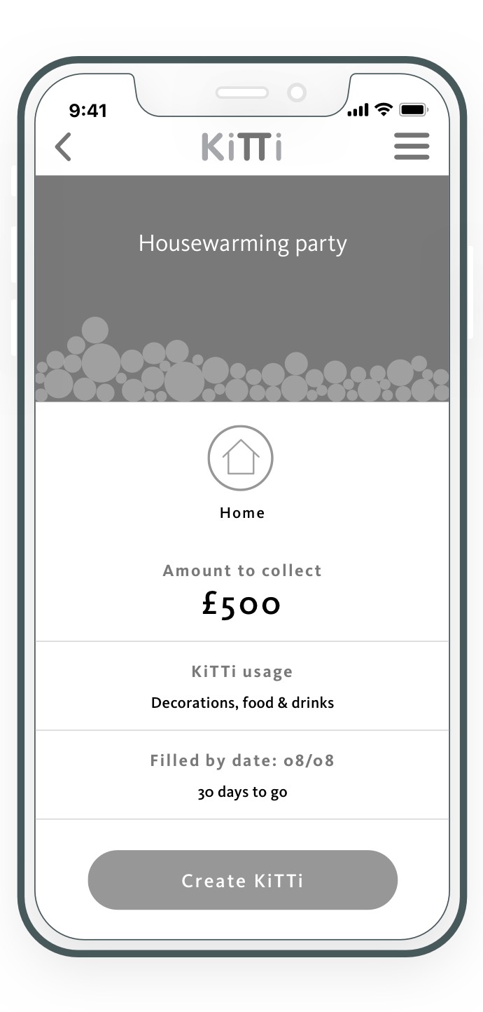
3. User Testing
Paper or digital, we tested our prototypes after each iteration. We challenged our design with 12 people, including some of the interviewees. We did 5 rounds of testing and 6 iterations, first on paper, then on clickable digital versions.
The first batches of testing was to challenge:
- The functionality flaws.
- The experience flow.
- The tone of voice.
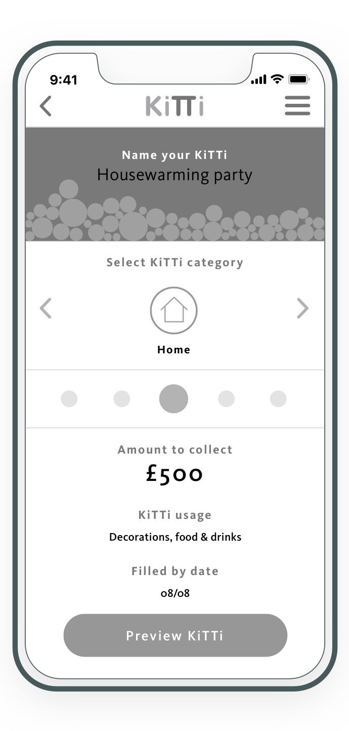
It also helped verifying if our solution was embedded seamlessly. The testing focus was to introduce category tagging when creating a KiTTi.
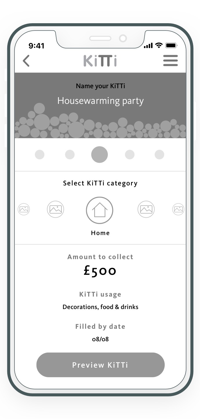


Key findings
- Users liked scrolling through the categories.
- Users felt that the name of the KiTTi and the category section were far apart, disjoined.
- Having both amounts in the jar and the category icon made it cluttered.
- Users found the avatar too small.
The flow was right but the tone of voice needed some work. We changed the verbiage to make it more welcoming and challenged it along with:
- The iconography.
- The placement of navigation elements.

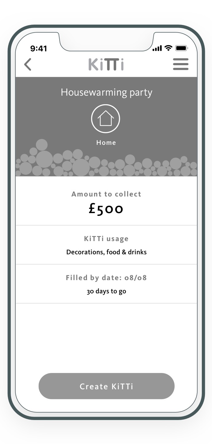


Key findings
- Replacing the additional icons with arrows removed the fun element.
- Users found the KiTTi name being closer to the category much more clear.
- Users found the information on the jar with no category icon to be much apparent.
- Users like the category icon but some still had problems to see it.
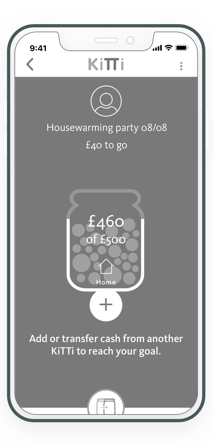
For this round of testing, we wanted to verify:
- The color scheme.
- The iconography.
- The micro interactions to appeal to both organizer and participants.
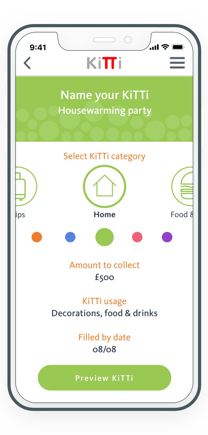

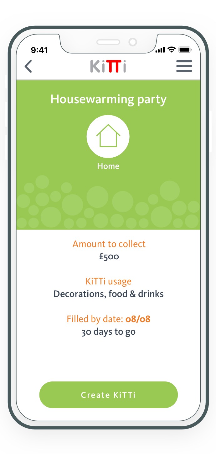


Design amends
We removed the arrows and put the category icons further apart to give some breathing space.
Users liked seeing the color, KiTTi name and icon combined in one section.
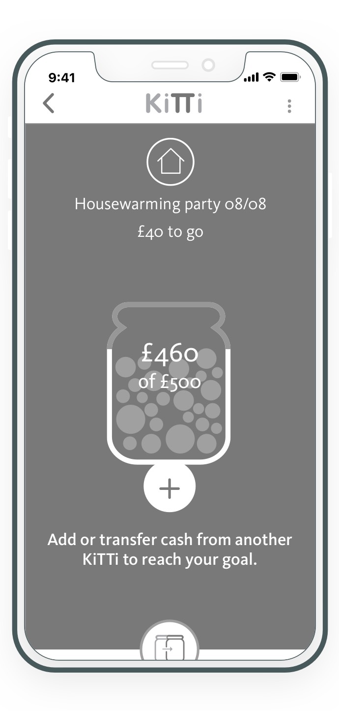
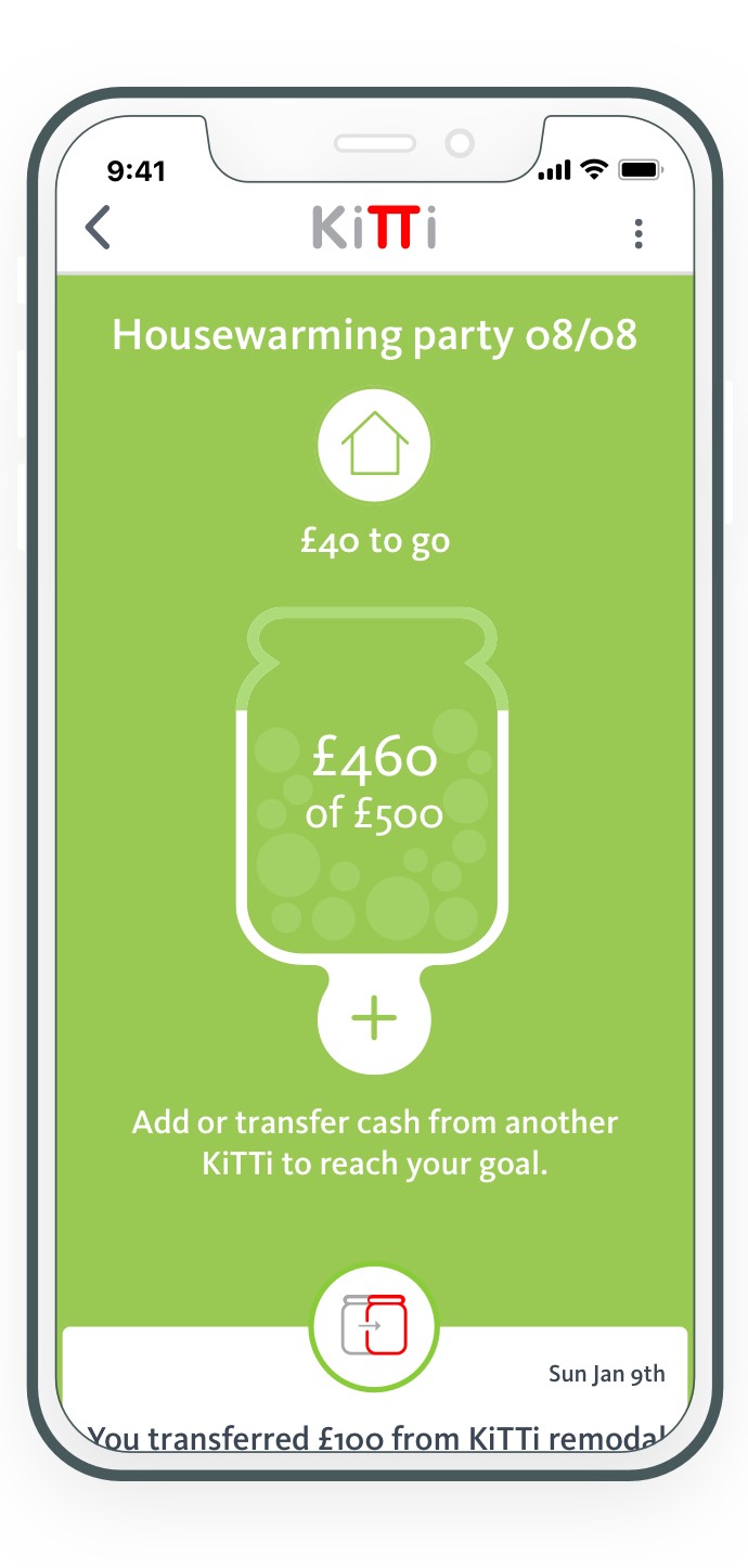
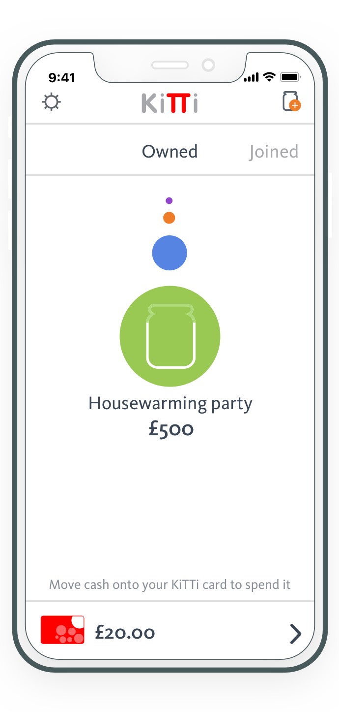
Users liked the simplicity of the jar and the additional features hidden under the “plus“ sign.
We removed picture or category icon to keep a clean and uncluttered feeling.
Solution
Social spending, streamlined.
To transform a simple group payment concept into a full-featured, user-first product, we redesigned Kitti's experience to be as intuitive and playful as it is secure. By balancing informal UX patterns with financial safeguards, the new features drove higher user engagement, deeper transaction activity, and faster mobile release cycles-turning a BETA MVP into a trusted daily tool.