Optimizing Super Tickets reward claims for Verizon Up
MOBILE APP
Clarifying complexity to drive engagement.
Super Tickets, an exclusive rewards drop for Verizon Up members, saw a 51% spike in participation and a 48% drop in customer care calls after launch — by clarifying confusing eligibility rules, optimizing fulfillment, and addressing trust-breaking UX pain points.
The Problem: Confusing participation mechanics, lack of transparency, and friction during fullfillment led to declining engagement and rising support calls — at a time when reducing operational support volume was an org-wide priority. Unfulfilled tickets from user errors or backend strain created avoidable cost and complexity.
My role: I led the experience redesign to clarify rules, reduce friction, and rebuild trust — from audits and research to flows, sitemap, and concepting. The work helped elevate user confidence and reduce operational cost.
KEY SKILLS UX audit, competitive analysis, research stimuli, journey mapping, user flows, site map, and prioritization strategy.
Outcome
Clarity and confidence, rebuilt.
We redesigned the Super Tickets experience to clarify participation rules, eliminate friction during claim, and streamline fulfillment—ensuring both clarity for users and scalability for engineering. The result: fewer support calls, reduced backend strain, and significantly higher customer engagement. The launch happened within 2 months, with rapid adoption and strong internal alignment.
Results (first 3 months post-launch):
Increase in Super Tickets participation — indicating higher engagement and successful feature adoption.
Drop in customer care calls — directly contributing to the organization-wide goal to reduce operational support volume.
Decrease in API claim-related calls — showing reduced backend friction and minimizing future tech debt.
Users agreed rules were clearly outlined — validating clarity and improved comprehension.
Next Steps:
- Extend form timer to 8 minutes.
- Optimize delivery input flow.
- Introduce countdown reminder.
- Enable sign-in via device tech.
- Allow multiple delivery addresses.
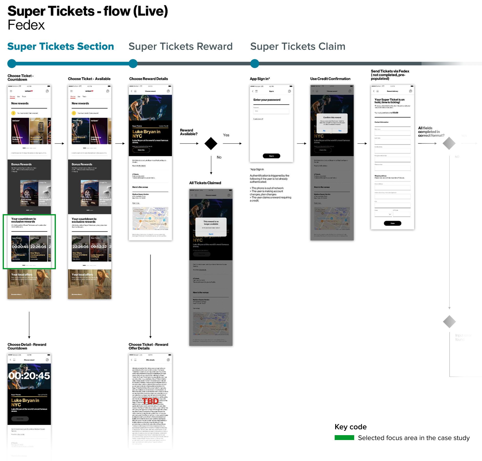
1. Discovery
The discovery phase began with a deep dive into the existing Super Tickets experience. We reviewed user flows, past research, Voice of the Customer insights, and customer care transcripts to clarify and validate our understanding of the current claim process.
We focused on four key areas:
- Understanding the design rationale behind Super Tickets, distinct from standard rewards.
- Evaluating how participation and eligibility rules were (or weren't) presented across the journey.
- Diagnosing mismatches between documented and actual user flows.
- Surfacing customer and business needs based on behavioral patterns and known pain points.
Alongside the artifacts, we reviewed direct feedback from customers and care specialists to help validate experience gaps and shape our audit priorities:
- "I'm unclear whether my monthly credit is used when I don't win." — 8-year customer
- "They're gone by the time I can scroll back up to claim them." — 3-year customer
- "Why do I need to enter my details when Verizon already has my address?" — 4-year customer
- "Some customers don't understand why their Super Tickets claim was unsuccessful." — Customer Care Specialist
These quotes revealed confusion around eligibility, fulfillment, and claim timing — and helped ground our assessment in real user experience.
My primary focus was auditing the user flows to identify discrepancies, outdated logic, and experience gaps.
Key findings
- Several user flows were outdated, with missing logic and misaligned states that needed correction.
- While no major structural gaps were found, a key pattern emerged: the claim location changed when tickets were available, which, while intentional to encourage engagement, was likely contributing to spikes in API calls.
- Only one participation rule (claim availability) was consistently communicated; other critical eligibility criteria were missing across the experience.
After aligning with the team, I revised and restructured the documented flows to establish a more accurate baseline — which became foundational for UX writing and broader experience refinement.
To wrap up our audit, we translated our insights into a clear, validated view of customer and business needs. I partnered with the product manager to structure and prioritize these findings into an actionable foundation for upcoming UX, content, and system changes.
What we learned from the competition:
To inform our approach, we analyzed how competitors handled time-based ticket availability across live and non-live events — including concerts, sweepstakes, lotteries, and digital promotions.
We identified three key patterns:
1. Time-based event mechanics
- Live events prioritized immediacy, with availability windows lasting hours or even minutes.
- Non-live formats centered on submission deadlines, with outcomes shared later.
- In both cases, clear timing helped set user expectations and drive urgency.
2. Engagement without strain
- Competitors like Hamilton Lottery, Disney Movie Rewards, and the London Symphony Orchestra used dynamic messaging and staggered release tactics to keep users engaged — while minimizing backend load.
- These strategies balanced customer excitement with operational resilience.
3. Rule transparency
- Clear eligibility and participation rules were consistently surfaced upfront, often through progressive disclosure or inline guidance.
- This reduced confusion and support dependency — a key learning for us.
The analysis concluded by reviewing the participation rules communication under the guidance of the content strategist, informing our content strategy and structural hierarchy.
2. Product strategy
To build a more competitive experience, we conducted a feature analysis comparing Verizon's Super Tickets with similar offerings from entertainment and digital rewards programs — including the London Symphony Orchestra, Hamilton Lottery, and Disney Movie Rewards.
We organized features into a clear matrix to validate existing functionality and identify enhancement opportunities. This helped pinpoint experience gaps and inspired four new features to elevate the Super Tickets experience.
Four feature opportunities were identified:
- The waiting room: Places participants in a virtual holding area before the event opens, helping manage demand and traffic surges.
- Participant count display: Builds real-time anticipation and a sense of scale by showing how many others are in line.
- Ticket inventory display: Displays how many tickets remain to encourage urgency and informed decision-making.
- Event reminder notification: Drives attendance and engagement by prompting customers before the event begins.
These features laid the groundwork for experience differentiation and informed our upcoming UX strategy.
Before advancing new features, we partnered with product and tech leads to validate feasibility and define next steps for testing and implementation.
Our design proposal:
- Integrate up to two new features.
- Support integration with updated flows and prototypes.
- Validate technical feasibility before user testing.
Feasibility outcomes:
- Waiting room: Excluded due to engineering complexity.
- Participant count & ticket inventory: Blocked by internal policy restricting display of volume-based data.
- Event reminder notification: Required a shift in timeline, but was ultimately approved.
Outcome:
I collaborated with product and engineering to negotiate a path forward for the event reminder notification. We secured alignment to validate interest through user testing and move toward implementation in an upcoming sprint.
To define what needed redesign, we cross-referenced prior research artifacts, competitive insights, and feature analysis. This helped us pinpoint experience gaps and confirm which parts of the Super Tickets journey most needed attention.
We prioritized clarity around participation rules and identified three key areas to focus our redesign efforts:
- Super Ticket Section: Where users first encounter the event and its structure.
- Super Ticket Reward Card: Communicates what customers can win and how.
- Super Ticket Claim Flow: Guides users through reward redemption.
3. Design explorations
We explored variations in content and experience design across the three key areas, focusing on clarity, motivation, and perceived fairness. To avoid overwhelming users during testing, we limited experiments to 2-3 variations per area, transforming them into quick-turn prototypes for feedback.
Content experiments focused on:
- Claiming time mechanics.
- Time-based vs. first-come, first-served rules.
- Perceived winning probability.
- Eligibility frequency.
- Credit usage clarity.
Experience improvements targeted:
- Communicating future eligibility.
- Optimizing the form countdown timer.
To streamline early feedback, we used low-fi (paper and digital) prototypes. These allowed us to test messaging and experience updates rapidly without investing in high fidelity design too early.
Want to see an example?
4. User testing & Design iterations
We collaborated with the research team to develop the research brief and stimuli, then the team conducted moderated usability testing over five days. Each session included five participants (25 total), observed live by the full cross-functional team to identify friction points, content gaps, and unmet user expectations.
The team synthesized findings daily and in some cases, we were able to iterate overnight, testing improved versions the very next day — improving clarity, interaction patterns, and content hierarchy across the Super Ticket claim flow.
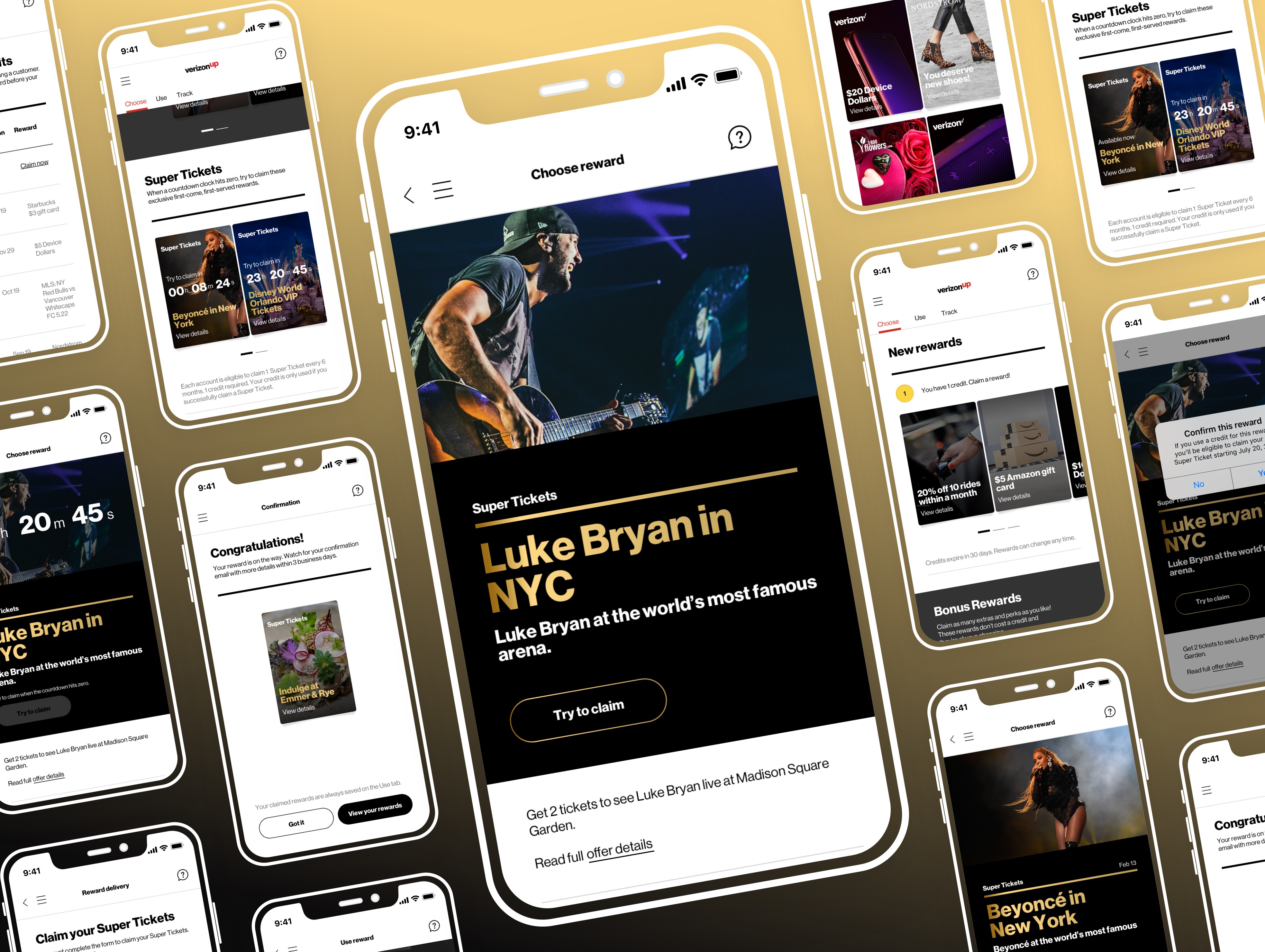
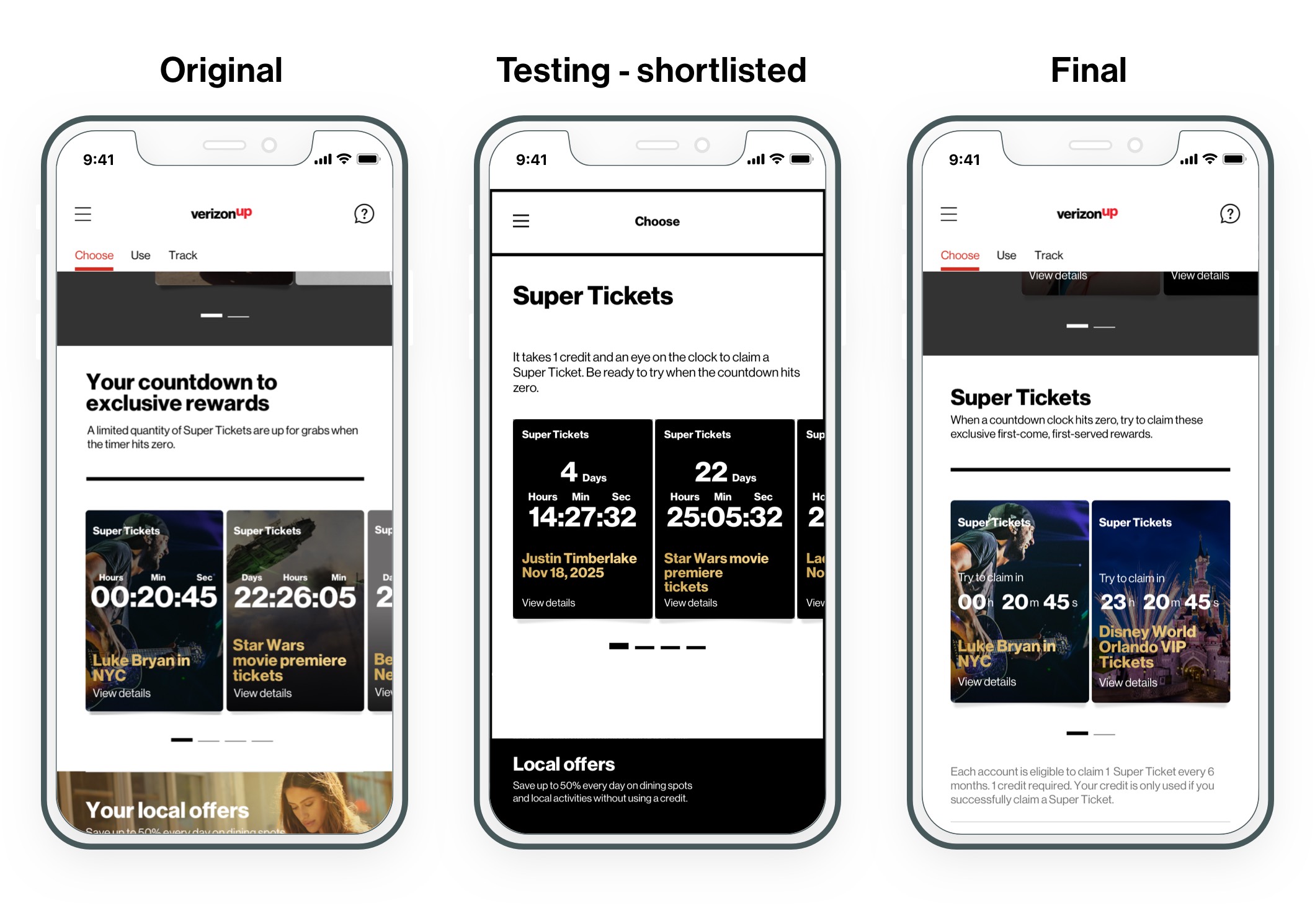
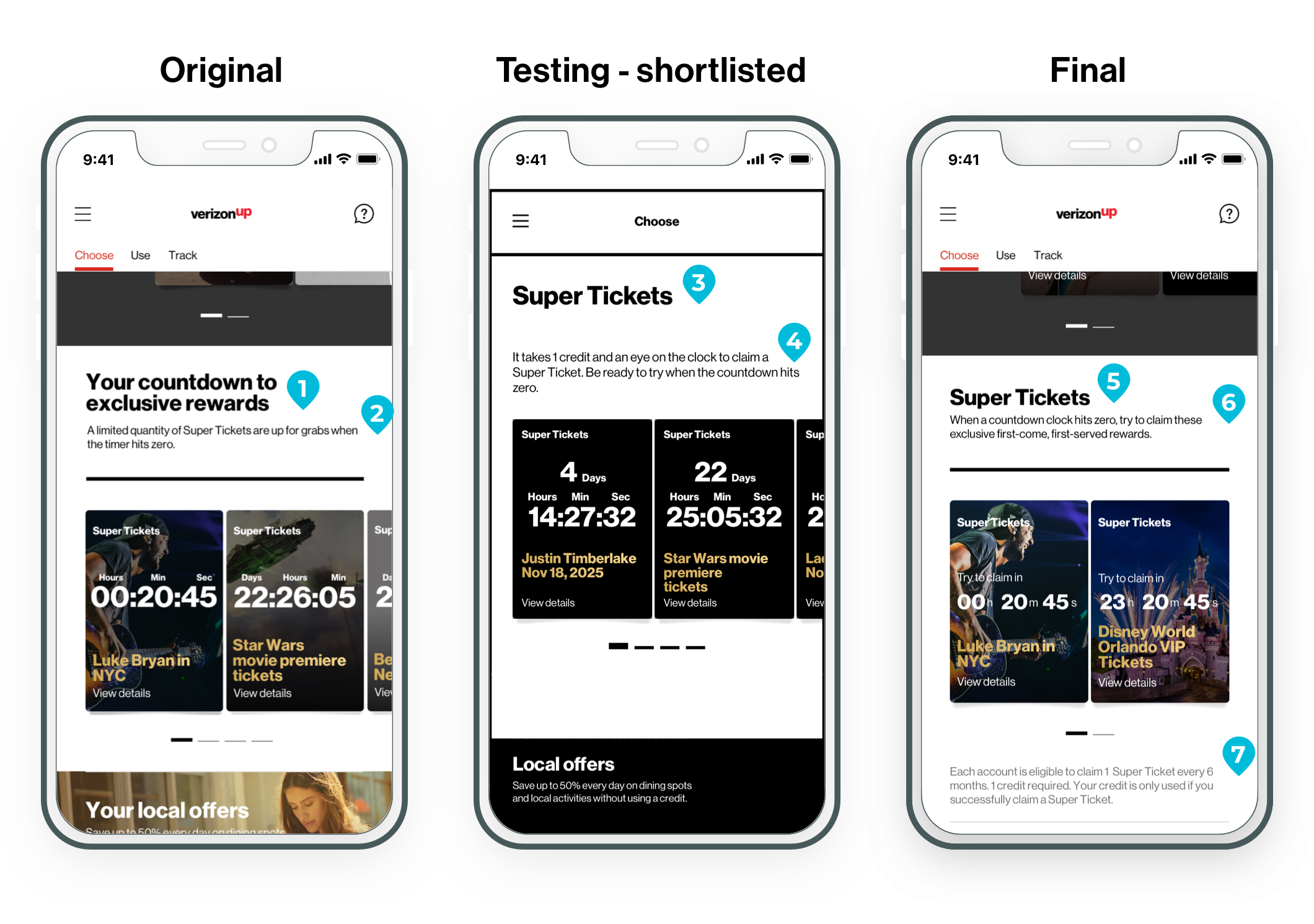
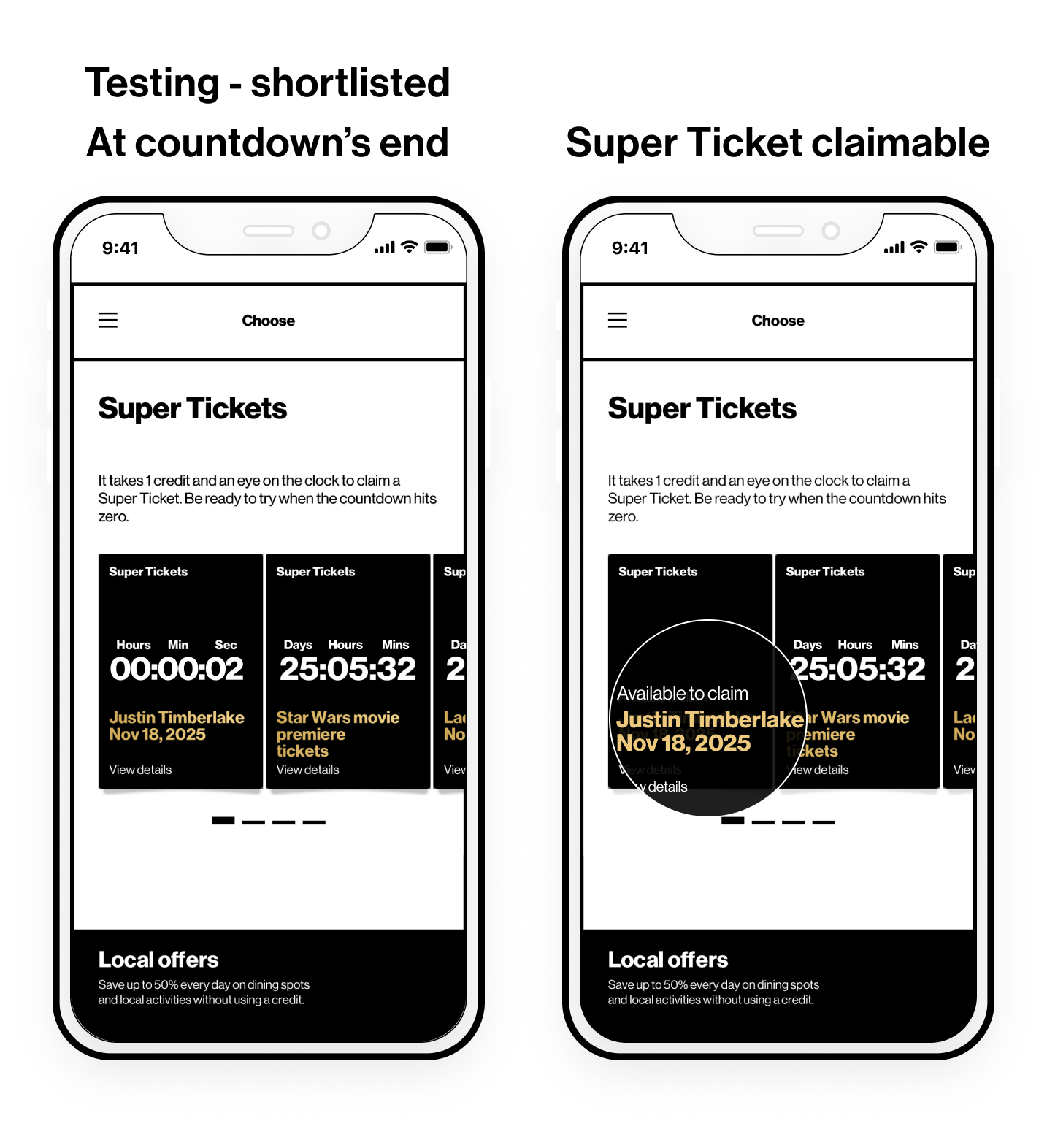
The "Choose" tab hosts the upcoming Super Tickets, where users can attempt to claim rewards. While this section displayed one participation rule, users struggled to understand key details like eligibility, timing, and credit usage.
Problem
During the countdown phase, the title lacked specificity and consistency with other sections. Participation rules were sparse, leading to confusion about when tickets could be claimed, whether winning was guaranteed, and how credits were used.
Design goals
- Clearly state when tickets can be claimed.
- Emphasize that claiming does not guarantee a win.
- Highlight the time-sensitive and unrestricted nature of the reward.
- Explain credit usage and eligibility frequency.
- Align section title with reward type and page conventions.
Prototype focus
Low-fidelity paper prototypes revised the title, added key participation details, and clarified availability windows.
We tested how well users:
- Understood the claim rules.
- Interpreted credit usage outcomes.
- Perceived their chances of success.
Content audit findings
Section title lacked specificity about the reward.
Only one participation rule (claim availability) was shown.
User testing feedback
Updated section title helped users recognize reward type.
Adding credit requirements increased clarity.
However, some still believed winning was guaranteed. Others questioned if credits would be lost after failed attempts.
Design refinements based on user insights
Retained updated section title for consistency across sections.
Reordered content to clarify time sensitivity and that a win is not guaranteed.
Clearly stated credit usage: credits are only deducted upon successful claim.
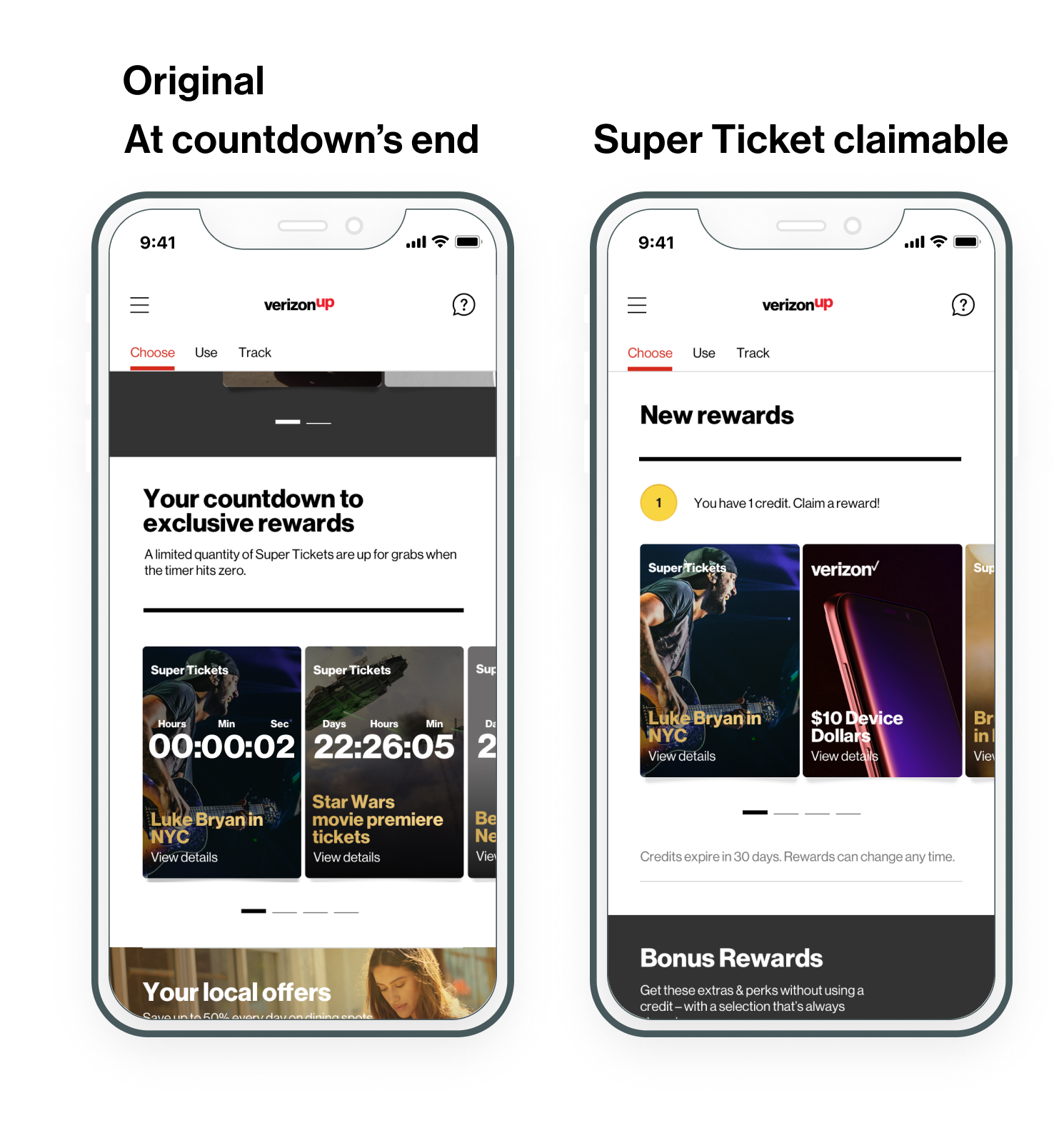
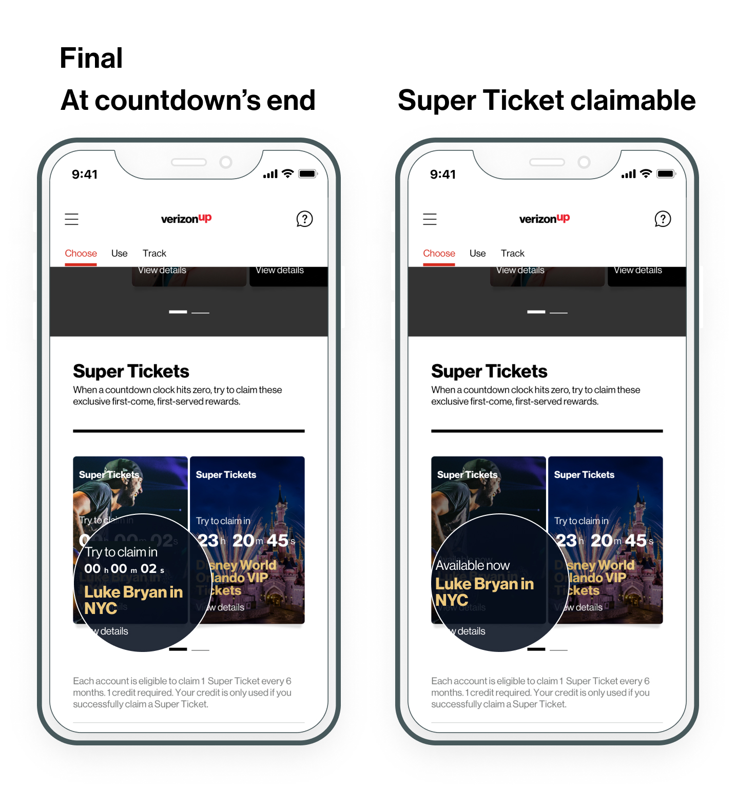
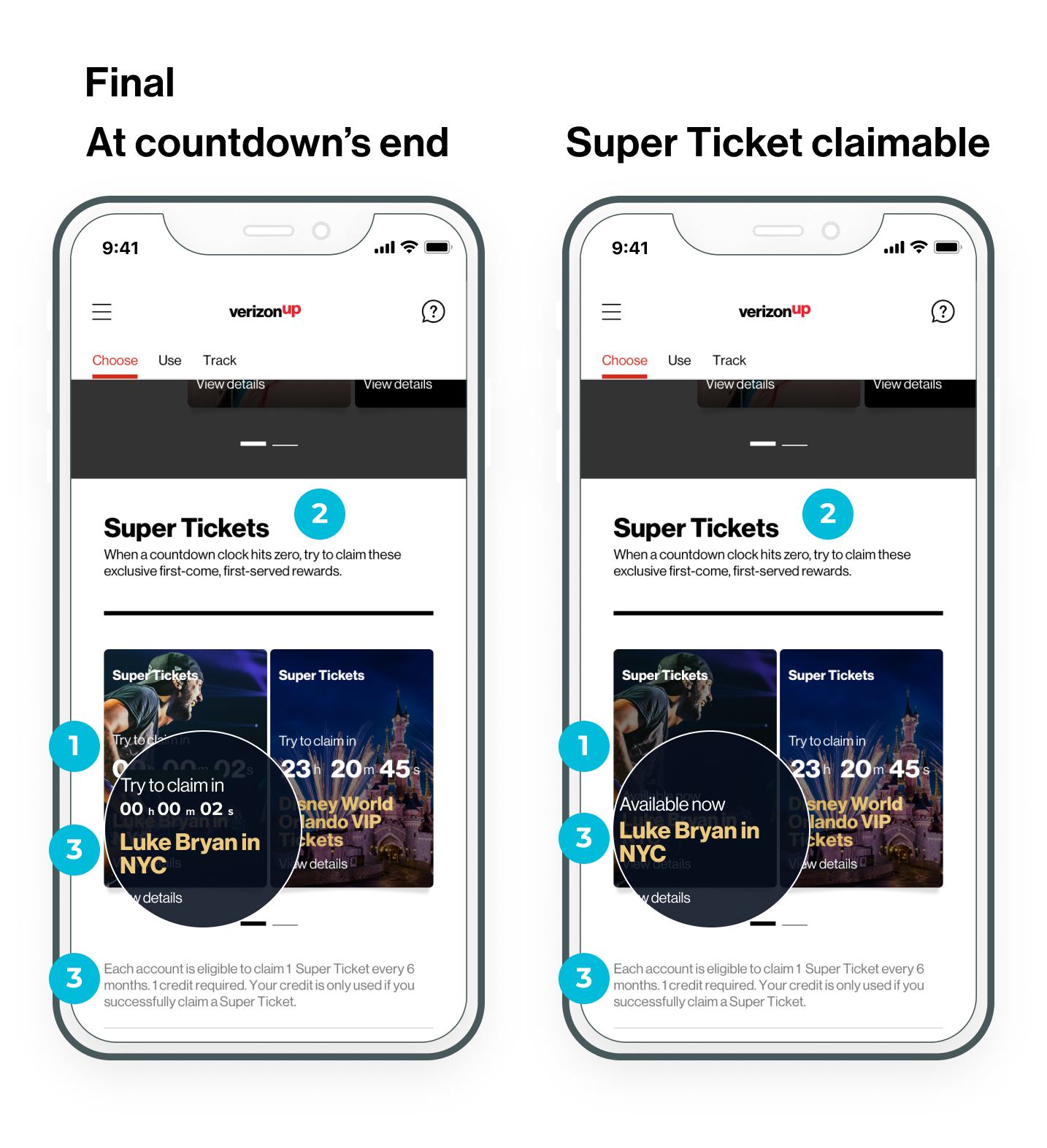
The "Super Tickets" section hosted upcoming Super Tickets rewards until the countdown concluded. When a Super Ticket reward became claimable, the card moved to the "New Rewards" section, disrupting the user flow and creating inconsistencies compared to other sections.
Problem
At the countdown's conclusion, users were forced to scroll to the top of the page to find the newly available reward.
This relocation:
- Slowed claiming speed, reduced users' winning chances.
- Introduced inconsistency across sections.
- Triggered additional API calls, impacting platform performance.
Users were confused by the abrupt move and some misinterpreted the call-to-action label, believing that claiming guaranteed a win.
Design goals
- Maintain available Super Tickets in their original section upon availability to preserve consistency and minimize disruption.
- Reduce technical strain by avoiding unnecessary API calls.
- Clarify the experience to set accurate expectations around claiming and winning.
Design solution
We proposed displaying available Super Tickets within the same section where users anticipated them.
- Created a revised user flow and prototype illustrating the improved reward availability logic.
- Collaborated with Tech and Product teams to validate feasibility and performance impact before user testing.
Feasibility validation & outcome
- Tech confirmed that relocating rewards triggered unnecessary API calls.
- Product and Tech teams validated the proposed solution to maintain rewards within the Super Ticket section, setting the stage for user testing.
Prototype focus
Low-fidelity prototypes kept available Super Tickets within their section and refined messaging.
We tested how well users:
- Navigated the claiming process without searching or scrolling.
- Understood the distinction between "claiming" and "winning."
- Perceived consistency across the Super Ticket experience.

Voice of Customer and audit findings
Users found it disruptive to relocate to another section to claim rewards.
Changes to reward location felt inconsistent compared to other sections.
The technical shift triggered extra API calls impacting platform performance.

User testing feedback
All users preferred finding and claiming rewards within the Super Ticket section.
Users appreciated the reduced need to scroll, enhancing their speed and confidence.
Some users misunderstood the messaging, believing that claiming guaranteed a win.
Design refinements based on user insights
We kept available Super Tickets within their section to minimize disruption and bring cohesion.
We reduced API calls by avoiding unnecessary reward relocation.
We clarified the supporting messages to set accurate expectations around winning chances.
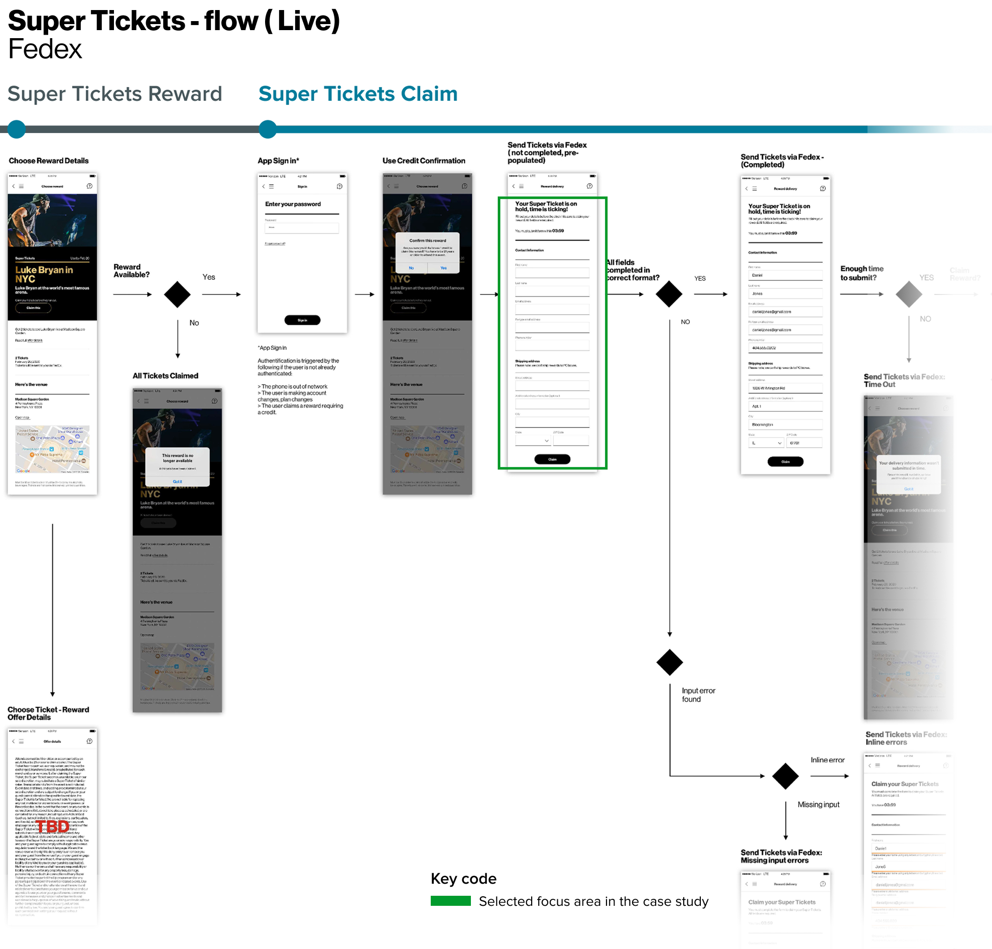
To claim a Super Ticket, members must meet three conditions:
- At least six months must have passed since their last claim.
- They must have one available credit.
- They must complete a delivery form within four minutes of claiming.
Once users confirmed credit usage, they were directed to complete a delivery form within a strict four-minute window. This final step introduced significant time pressure, resulting in usability friction and risking forfeiture of the reward.
Problem
The four-minute countdown to complete the form led to stress, especially for users who were:
- Typing slowly or using mobile devices.
- Inputting a delivery address different from the one on file.
This approach:
- Created a high-pressure environment.
- Provoked mixed emotional responses due to the blank form state.
- Increased the likelihood of user drop-off, particularly among less confident participants.
Design goals
- Reduce manual input to accelerate form completion.
- Maintain a sense of urgency without causing panic.
- Ensure successful reward claim without increasing cognitive load.
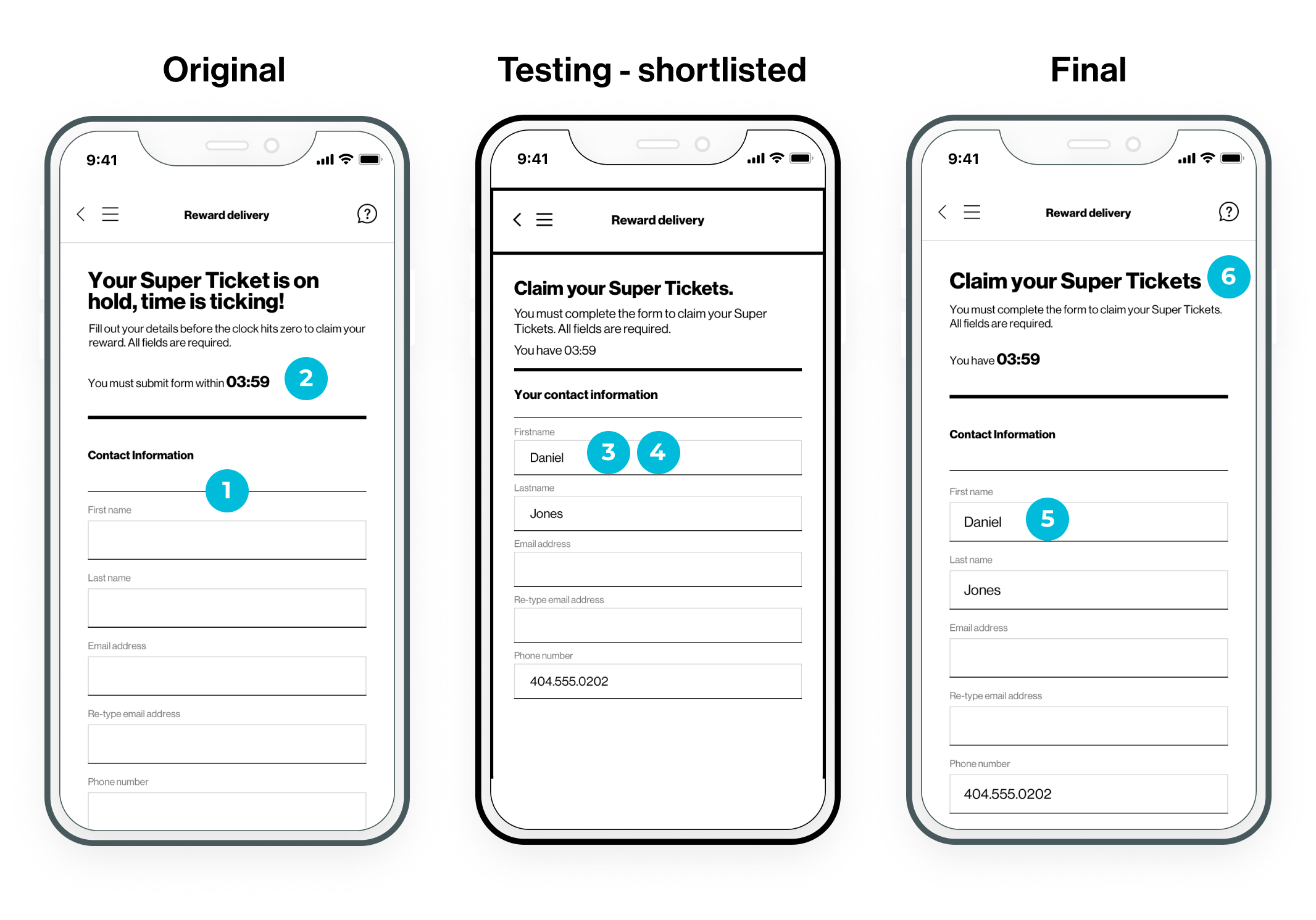
Design solution
As the design lead, I proposed two key enhancements:
- Optimize delivery input by allowing users to select a saved billing address via dropdown or confirm using a checkbox.
- Extend the submission timer from 4 to 8 minutes to reduce pressure while maintaining urgency.
Feasibility validation & outcome
Tech confirmed both enhancements—billing address selection and timer extension—required additional lead time for development.
To deliver value quickly, in partnership with Product, Tech, we prioritized a phased approach:
- Implement an interim version with form pre-population using billing data on file.
- Plan to roll out the full solution (dropdown + timer extension) in the next quarterly release.
Solution adaptation
In collaboration with Tech and Product, we released a refined interim design:
- Pre-populated the delivery form using billing information on file.
- Reduced user input to accelerate submission without overwhelming the experience.
Prototype focus
Low-fidelity prototypes showcased the pre-populated form and were used to test:
- User response to reduced manual input.
- Whether urgency was preserved without inducing panic.
- User trust and confidence in the pre-filled data.

Voice of the customer & audit findings
The form appeared blank, which created hesitation and uncertainty.
The short time window heightened user stress, especially when editing or entering alternate addresses.
User testing feedback
Users appreciated the pre-filled fields, it eased their stress and boosted their confidence.
The experience felt more intuitive and faster to complete.
Design refinements based on user insights
Retained the pre-population approach to minimize effort.
Continued with phased rollout-billing address selection and extended timer to follow next quarter.
To support implementation and ensure long-term scalability, I led the design deliverable package, finalizing key artifacts and collaborating closely with Product, Engineering, and QA for a smooth and confident handoff.
User flow
Spearheaded and finalized the end-to-end user flow production to reflect the redesigned experience and account for critical fulfillment edge cases.
This included new interaction moments:
- The delivery form timer extension (to reduce timeout friction).
- The abandonment logic (to address drop-off during claim).
Site map
Developed the program's first comprehensive sitemap to organize the full user journey across all reward types, encompassing the following sections:
- Learning about the program.
- Enrollment.
- Support & learning.
- First time use & returning use.
This helped the team see how different paths like enrollment, support, and return visits connected to reward experiences such as Partner, Verizon, Bonus, Super Tickets, and Local Offers.
Tech hand-off package
Delivered a detailed handoff package to ensure clarity across teams and minimize guesswork during implementation. It included:
- Annotated user flows & prototype screens.
- Asset documentation and fulfillment logic.
- Coverage of edge cases.
Solution
Clarity delivered, friction removed.
We clarified eligibility and participation rules across key touchpoints, lifting ambiguity and rebuilding trust. The updated claim and fulfillment flow minimized drop-off, reduced backend strain, and prevented future spikes in support calls.
By addressing both user confusion and technical bottlenecks, the experience now scales better and drives stronger engagement.
Post-launch, we reviewed analytics with cross-functional partners to validate improvements and align on next-phase opportunities.
Reflection & key takeaways
This project reinforced how thoughtful UX not only enhances usability but also drives measurable business impact. Our improvements reduced operational strain, minimized user errors, and cut down support queries during high-demand reward periods.
I learned that aligning design solutions with strategic business goals accelerates implementation and sharpens the ROI narrative, especially for high-visibility flows. Collaborating closely with product, internal and external tech partners helped us adapt designs to API and database constraints while building strong relationships with Marketing leadership and Legal to ensure speed and alignment.
Key actions that contributed to success include:
- Prioritized feasible and scalable improvements that delivered user and business value fast.
- Used data to validate pain points and measure impact post-launch.
- Partnered across Product, Engineering, Content, Marketing leadership and Legal to align speed and scope.